Company: Amazon (Amazon Flex)
Role: UX Designer II
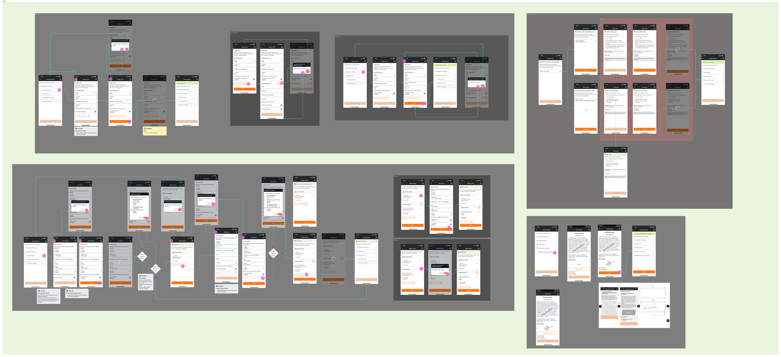
Scope: UK Background Check (BGC) Redesign
I led the redesign of the UK background check experience, transforming one of the most fragile steps in onboarding into a seamless in-app journey.
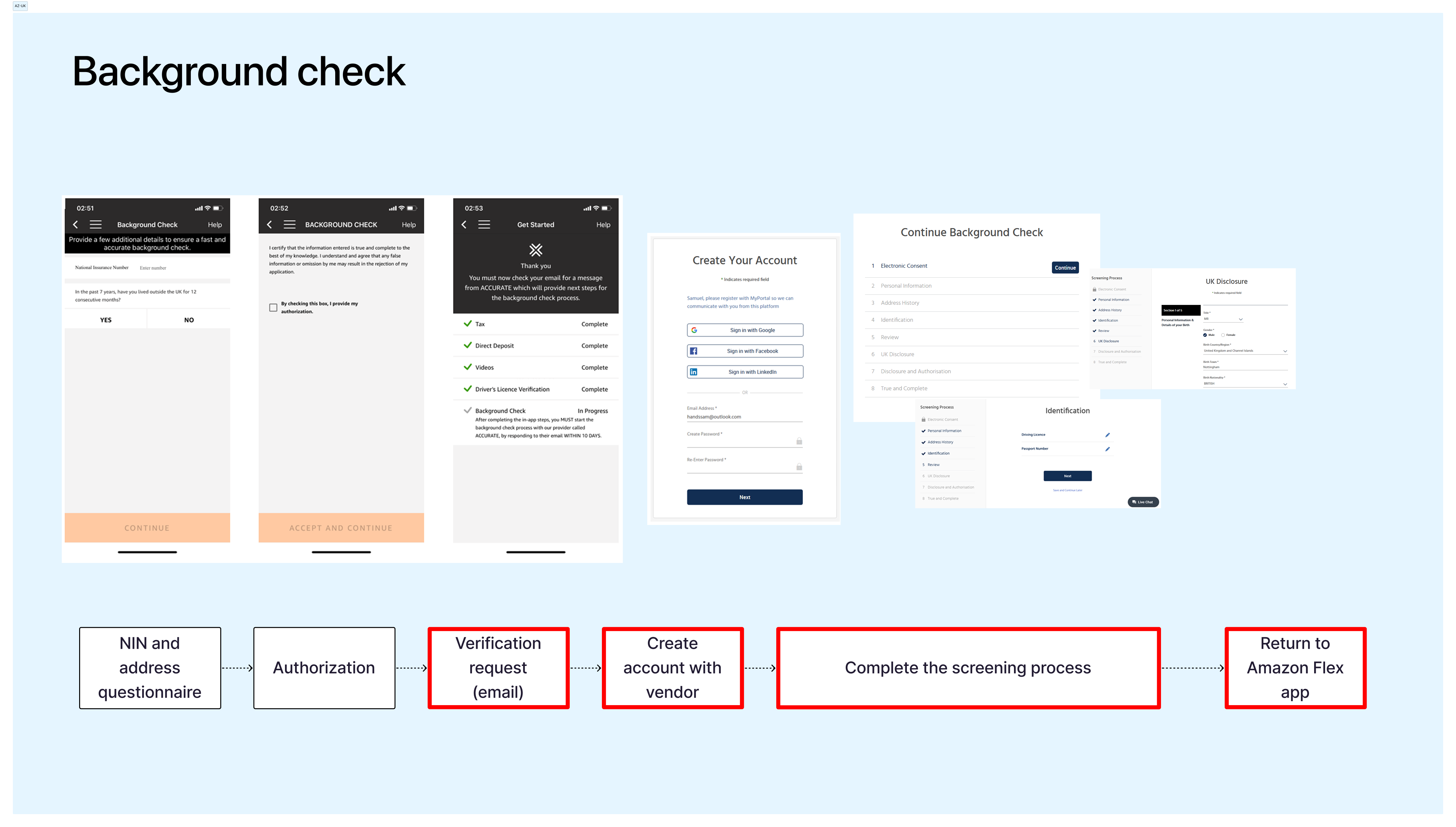
At the time, background checks required Delivery Partners (DPs) to leave the Flex app and complete their application on a separate 3rd party platform. The result was confusion, duplication of effort, and significant drop-off.
Rather than layering fixes on top of a broken handoff, the team focused on eliminating the handoff entirely.
The onboarding experience broke at the moment it mattered most.
Survey data revealed:
In 2023:
Drivers were asked to:
The experience wasn’t just long — it was fragmented. And fragmentation was driving yield loss.
The goal was not to replicate the vendor portal inside Flex. It was to simplify the system.
I anchored the redesign around three principles:
We reused onboarding data (NIN, DL, RTW) via existing APIs and built lightweight, focused UI to collect only what was missing (name history, address history, consent).
We validated addresses before submission, removed unnecessary document uploads, and ensured compliance requirements were handled without adding friction.
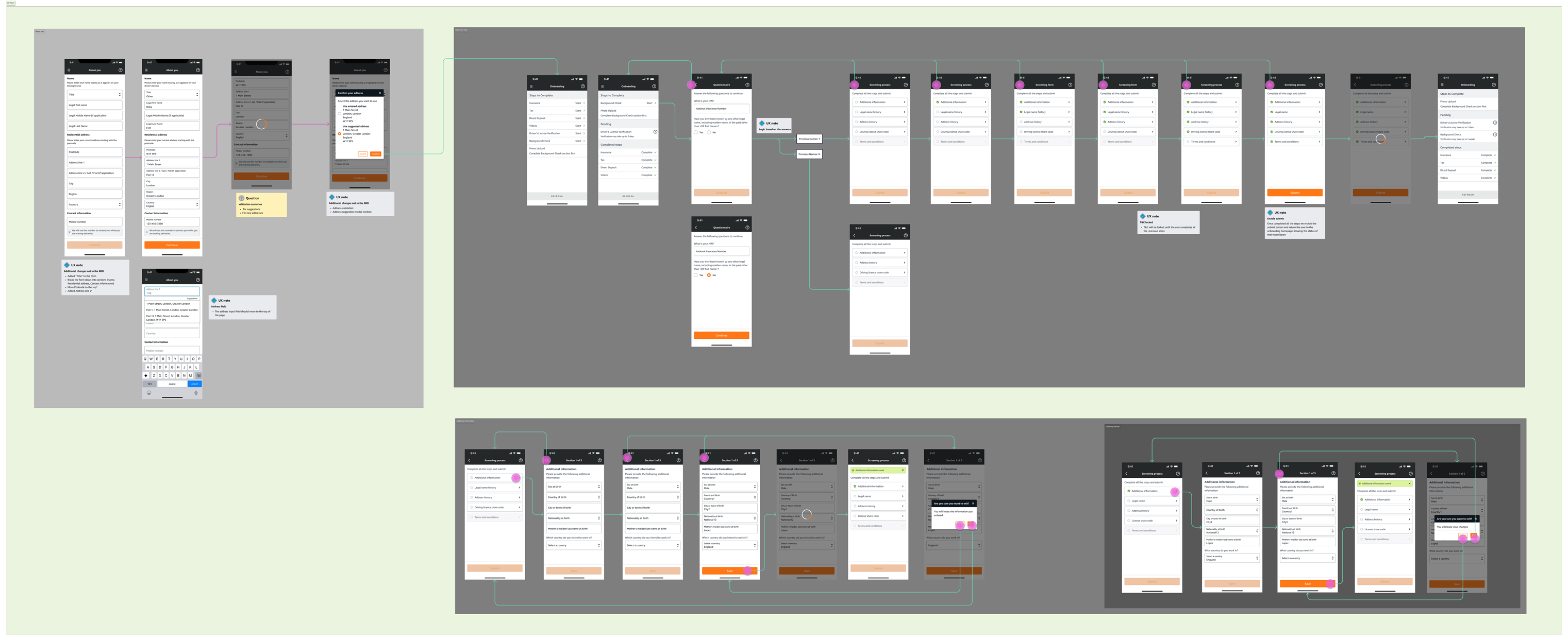
Throughout the project, I worked closely with Product and Engineering to understand technical constraints and make thoughtful trade-offs. There were disagreements — especially around scope and feasibility — but we aligned on delivering the best possible experience within current limitations, while designing for future improvements.
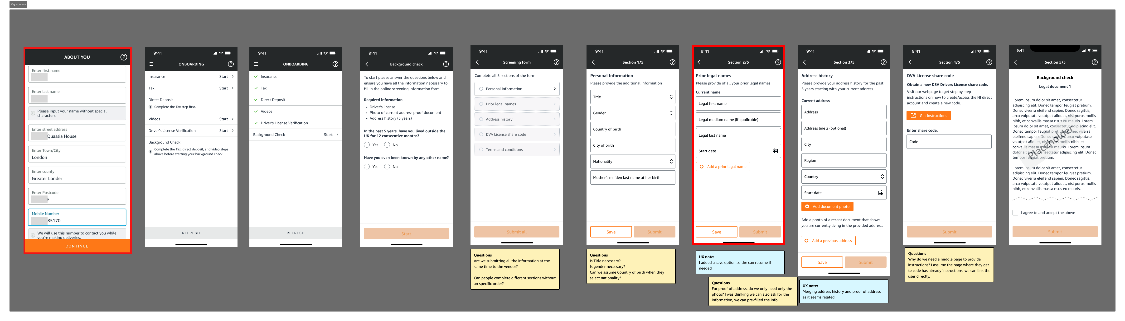
We launched UK background checks fully in-app.
What was previously a multi-channel process became a single, coherent experience.
Immediate Improvements
By removing the external dependency and simplifying the system, we reduced cancellations, improved completion rates, and created a stronger foundation for future onboarding improvements.
Fragmentation Is a Design Problem.
When users leave your product to complete critical steps, trust and momentum break.
Simplification Requires System Thinking.
The biggest gains came not from new UI, but from removing unnecessary structural complexity.
Progress Beats Perfection.
We delivered meaningful improvement within constraints — while keeping the door open for continued evolution.